Toast
A short message that confirms what just happened, such as a saved change or a failed upload, and goes away on its own. Mount <Toaster /> once, then call toast() from anywhere: a component, a store, or an API client outside React. The API follows sonner, the toast shadcn/ui uses.
<View style={{ height: 320 }}>
  <HStack gap="sm" wrap>
    <Button variant="outline" onPress={() => toast('Event created', { description: 'Friday at 10:00' })}>Default</Button>
    <Button variant="outline" onPress={() => toast.success('Changes saved')}>Success</Button>
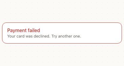
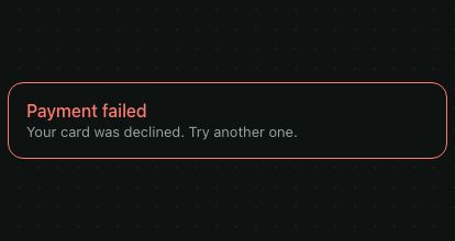
    <Button variant="outline" onPress={() => toast.error('Payment failed', { description: 'Check your card details.' })}>Error</Button>
    <Button
      variant="outline"
      onPress={() => toast('Message archived', { action: { label: 'Undo', onPress: () => toast('Message restored') } })}
    >
      Action
    </Button>
    <Button
      variant="outline"
      onPress={() => toast.promise(save(), { loading: 'Saving…', success: (name) => `${name} saved`, error: 'Could not save' })}
    >
      Promise
    </Button>
  </HStack>
  <Toaster />
</View>
Try the props
positionmaxdurationcloseButtondesign<Toaster />
Examples
Each example is live: edit the code and it runs.
Undo a delete
A shared drive: Delete removes the file at once, and the toast keeps an Undo button for six seconds, which puts it back where it was.
<View style={{ height: 360, width: '100%' }}>
  <List title="Design team" footer="Deleted files stay in Trash for 30 days.">
    {files.map((file) => (
      <ListItem
        key={file.id}
        title={file.name}
        description={file.meta}
        trailing={
          <Button size="sm" variant="ghost" accessibilityLabel={`Delete ${file.name}`} onPress={() => remove(file)}>
            Delete
          </Button>
        }
      />
    ))}
  </List>
  {files.length ? null : <Text color="textSecondary">No files left. Undo is still on the toast.</Text>}
  <Toaster id="drive" />
</View>
Setup
Render <Toaster /> once, as the last child of your root view, so it draws over every screen. It covers the screen without blocking touches. Pass the safe area as insets, from react-native-safe-area-context or your own values, so toasts clear the notch and the home indicator.
import { useSafeAreaInsets } from 'react-native-safe-area-context';
import { PatineProvider, Toaster } from 'patine-ui';

export default function App() {
  const insets = useSafeAreaInsets();
  return (
    <PatineProvider>
      <Navigation />
      <Toaster insets={insets} />
    </PatineProvider>
  );
}
Toasts come from the top on iOS, like its notifications, and from the bottom on Android and the web. Set position to choose.
Types
toast.success, toast.error, toast.warning and toast.info add a status icon in the theme's colors. toast.loading shows a spinner and stays until you update or close it.
<View style={{ height: 300 }}>
  <HStack gap="sm" wrap>
    <Button variant="outline" onPress={() => toast('Event created', { toasterId: id })}>Default</Button>
    <Button variant="outline" onPress={() => toast.success('Changes saved', { toasterId: id })}>Success</Button>
    <Button variant="outline" onPress={() => toast.error('Payment failed', { description: 'Check your card details.', toasterId: id })}>Error</Button>
    <Button variant="outline" onPress={() => toast.warning('Your trial ends in 3 days', { toasterId: id })}>Warning</Button>
    <Button variant="outline" onPress={() => toast.info('A new version is available', { toasterId: id })}>Info</Button>
    <Button variant="outline" onPress={() => toast.loading('Syncing…', { toasterId: id, duration: 3000 })}>Loading</Button>
  </HStack>
  <Toaster id={id} />
</View>
Each example on this page sends its toasts to its own <Toaster id> with toasterId, so they don't show up in the others. In an app, one <Toaster /> and plain toast() calls are all you need.
Archive with Undo
action adds a button, such as Undo. The toast closes after it's pressed. A toast with an action stays until it's used or closed, so there's time to reach the button; set duration to close it on a timer anyway.
<View style={{ height: 340, maxWidth: 440, width: '100%' }}>
  <List title="Inbox">
    {mails.map((mail) => (
      <ListItem
        key={mail.id}
        title={mail.from}
        description={mail.subject}
        trailing={<Button size="sm" variant="ghost" onPress={() => archive(mail)}>Archive</Button>}
      />
    ))}
  </List>
  {mails.length ? null : <Text color="textSecondary">Inbox zero 🎉</Text>}
  <Toaster id={id} />
</View>
Sync, from loading to done
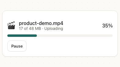
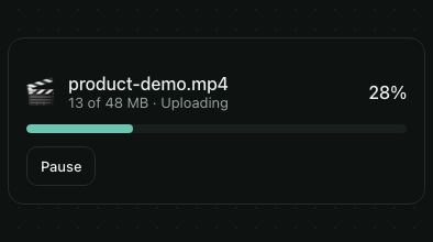
toast.promise shows a loading toast and turns it into a success or an error toast when the promise settles. A function message gets the result or the error.
<View style={{ height: 240 }}>
  <HStack gap="sm">
    <Button
      onPress={() =>
        toast.promise(
          upload(),
          {
            loading: 'Uploading…',
            success: (photo) => `${photo.name} uploaded`,
            error: (error) => `Upload failed: ${(error as Error).message}`,
          },
          { toasterId: id }
        )
      }
    >
      Upload photo
    </Button>
  </HStack>
  <Toaster id={id} />
</View>
To update any toast in place, send it again with the same id. Every call returns the id, and toast.dismiss(id) closes it; toast.dismiss() closes them all.
<View style={{ height: 220 }}>
  <HStack gap="sm">
    <Button onPress={sync}>Sync now</Button>
    <Button variant="outline" onPress={() => toast.dismiss()}>Dismiss all</Button>
  </HStack>
  <Toaster id={toasterId} />
</View>
Closing
A toast closes after duration (4 seconds by default). The timer pauses while the toast is touched or hovered, and a sideways swipe closes it. The web shows a close button on every toast; other platforms show it on toasts that stay until they're closed. Set closeButton to show or hide it everywhere.
max toasts show at once (3 by default). A newer toast pushes the oldest out of view, and it comes back with its time left when there's room.
Designs
- Patine: a card with a border and a soft shadow, centered.
- iOS: a rounded banner on the sheet surface, like a notification.
- Material: the Material 3 snackbar, dark on a light screen (light on a dark one), with a text button.
- Web: sonner's card, at the bottom right of a wide screen.
Press each one to compare:
<View style={{ height: 260 }}>
  <HStack gap="sm" wrap>
    {Object.entries(DESIGNS).map(([design, label]) => (
      <Button
        key={design}
        variant="outline"
        onPress={() => toast('Photo saved to Recents', { toasterId: `design-${design}`, action: { label: 'View', onPress: () => {} }, duration: 4000 })}
      >
        {label}
      </Button>
    ))}
  </HStack>
  {Object.keys(DESIGNS).map((design) => (
    <Toaster key={design} id={`design-${design}`} design={design as keyof typeof DESIGNS} position="bottom" />
  ))}
</View>
Guidelines
Offer Undo instead of asking first. Act now and let people take it back.
Don't confirm a small action with a toast. “Are you sure?” in a toast vanishes before it's answered.
Say what happened in a few words. It's read aloud and gone in seconds.
Don't put an error that needs fixing in a toast. If people must act, keep the message on screen next to what failed.
Accessibility
| Behaviour | |
|---|---|
| Role | status in a polite live region on the web (alert for errors); announceForAccessibility on iOS and Android. |
| Announced | Each toast is read when it appears; errors interrupt, the rest wait their turn. |
| Keyboard (web) | The action and close buttons are real buttons with keyboard focus on the web. |
| Touch target | The action and close buttons have 44pt touch targets; the close button reads "Close notification" (closeLabel). |
| Reduce motion | With reduce motion on, toasts appear and leave without sliding. |
- A toast with an action doesn't close on its own (WCAG 2.2.1), and the timer pauses while it's touched or hovered.
- The status icon isn't the only signal: say what happened in the message.
API
Toaster
| Prop | Type | Default | Description |
|---|---|---|---|
position | 'top' | 'bottom' | 'top' on iOS, 'bottom' elsewhere | The edge toasts stack from. |
offset | number | theme spacing.lg | Space between the toasts and the edge, past the insets. |
insets | { top?, bottom?, left?, right? } | — | The safe area to keep clear. |
max | number | 3 | The most toasts shown at once. |
duration | number | 4000 | How long a toast stays, in ms, unless it sets its own. |
closeButton | boolean | on the web, and on toasts that stay | A close button on every toast. |
closeLabel | string | 'Close notification' | The close button's label for screen readers. |
id | string | — | Shows only toasts sent with this toasterId, for a second Toaster. |
style | StyleProp<ViewStyle> | — | The box the toasts are laid out in. |
theme | DeepPartial<Theme> | — | Theme override. |
design | 'brand' | 'ios' | 'material' | 'web' | 'native' | from PatineProvider | The look to follow: brand, iOS, Material or web, or 'native' for the platform's own. |
toast()
toast(message, options) shows a toast and returns its id. toast.success, toast.error, toast.warning, toast.info and toast.loading take the same arguments.
| Option | Type | Default | Description |
|---|---|---|---|
description | string | — | A second, smaller line under the message. |
action | { label: string; onPress: () => void } | — | A button in the toast. The toast closes after it's pressed, and stays until then. |
duration | number | the Toaster's | How long it stays, in ms. Infinity keeps it until it's closed. |
id | string | number | a new id | Reuse an id to update that toast in place. |
toasterId | string | — | Show it only in the <Toaster id> with this id. |
| Method | Description |
|---|---|
toast.dismiss(id?) | Closes the toast with this id, or every toast. |
toast.promise(promise, { loading, success, error }, options?) | A loading toast that turns into a success or an error toast. promise can be a function that returns one. Returns the id. |
Right to left and custom styles work the same on every component: see Internationalization and right to left and Styling.
For AI
Give this page to an assistant as Markdown, with Copy page at the top, or the whole API in llms-full.txt.
With the Patine MCP server, it asks for get_component_docs({ name: "Toaster" })