TextField
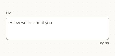
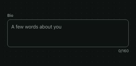
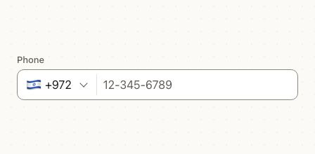
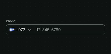
TextField is a single-line text input with a label, helper text and an error message. It's drawn like the picker fields and Select in each design, so a form of text fields, dates and selects looks like one form. For several lines, use TextArea.
<TextField
  label="Email"
  placeholder="[email protected]"
  helperText="We'll send the receipt here"
  value={email}
  onValueChange={setEmail}
  keyboardType="email-address"
  autoComplete="email"
  autoCapitalize="none"
/>
onValueChange fires as the user types, pastes or clears, never when you set value from your code. Leave value out and pass defaultValue for an uncontrolled field. Every other TextInput prop, such as keyboardType, autoComplete, returnKeyType or onSubmitEditing, passes through.
Try the props
helperTextstartIconprefixsuffixmaxLengtherrordesign<TextField
label="Email"
value={email}
onValueChange={setEmail}
helperText="We'll send the receipt here"
/>
Examples
Each example is live: edit the code and it runs.
A sign-in form
The fields check themselves when the user taps Sign in, and the server's answer comes back as an error on the field it's about.
<VStack gap="md">
  <VStack gap="xs">
    <Heading level={3}>Welcome back</Heading>
    <Text color="textSecondary">Sign in to see your invoices.</Text>
  </VStack>
  <TextField
    label="Work email"
    value={email}
    onValueChange={setEmail}
    error={errors.email}
    keyboardType="email-address"
    autoComplete="email"
    autoCapitalize="none"
  />
  <TextField
    label="Password"
    value={password}
    onValueChange={setPassword}
    error={errors.password}
    secureTextEntry
    autoComplete="current-password"
    onSubmitEditing={signIn}
  />
  <Button loading={loading} onPress={signIn}>Sign in</Button>
  <Link onPress={() => {}}>Forgot your password?</Link>
</VStack>
Errors and helper text
error turns the outline and label red and shows the message under the field, in place of helperText. error={true} marks the field invalid without a message. required adds an asterisk to the label. The field doesn't check the value: set these from your form, as with every other field (see Forms).
<TextField
  label="Full name"
  required
  value={name}
  onValueChange={setName}
  onBlur={() => setTouched(true)}
  helperText="As it appears on your card"
  error={touched && !name ? 'Enter your name' : undefined}
/>
Passwords
secureTextEntry hides the text and adds a Show / Hide button, so people can check what they typed. Turn the button off with passwordToggle={false}.
<TextField label="Password" secureTextEntry autoComplete="current-password" textContentType="password" />
Clear button, icons, prefix and suffix
clearable shows a × while there's text. startIcon and endIcon take any node, such as an icon from your icon set; prefix and suffix are text in the secondary color, like a currency or a unit.
<View style={{ gap: 16 }}>
  <TextField label="Search" placeholder="Name or email" clearable startIcon={<Text color="textSecondary">⌕</Text>} />
  <TextField label="Price" prefix="$" suffix="USD" keyboardType="decimal-pad" defaultValue="49.00" />
  <TextField label="Website" prefix="https://" autoCapitalize="none" keyboardType="url" />
</View>
A username with a character count
showCount shows how many characters there are under the field, out of maxLength when it's set.
<TextField label="Username" maxLength={20} showCount autoCapitalize="none" />
Disabled and read-only
disabled dims the field and blocks it. readOnly keeps the text sharp and selectable, for a value people can copy but not change, like an account ID.
<View style={{ gap: 16 }}>
  <TextField label="Account ID" defaultValue="acct_1Pq8Xz42Lm" readOnly helperText="Share this with support" />
  <TextField label="Company" defaultValue="Acme Inc." disabled helperText="Managed by your organization" />
</View>
Focus from code
ref reaches the TextInput, to focus(), blur() or clear() it, such as moving to the next field on Return.
<View style={{ gap: 16 }}>
  <TextField label="First name" returnKeyType="next" onSubmitEditing={() => last.current?.focus()} submitBehavior="submit" />
  <TextField ref={last} label="Last name" returnKeyType="done" />
</View>
A shipping address form
A shipping form: each field moves to the next on Return, errors show once a field has been left, and the button checks them all.
<VStack gap="md" style={{ maxWidth: 420 }}>
  <TextField label="Full name" autoComplete="name" returnKeyType="next" onSubmitEditing={() => refs.email.current?.focus()} {...field('name')} />
  <TextField ref={refs.email} label="Email" autoComplete="email" keyboardType="email-address" autoCapitalize="none" helperText="For the shipping updates" returnKeyType="next" onSubmitEditing={() => refs.street.current?.focus()} {...field('email')} />
  <TextField ref={refs.street} label="Street address" autoComplete="street-address" clearable {...field('street')} />
  <HStack gap="sm" align="flex-start">
    <TextField label="City" autoComplete="postal-address-locality" style={{ flex: 2 }} {...field('city')} />
    <TextField label="ZIP" keyboardType="number-pad" maxLength={5} autoComplete="postal-code" style={{ flex: 1 }} {...field('zip')} />
  </HStack>
  <Button onPress={submit}>Continue to payment</Button>
  {sent ? <Text color="success">Address saved.</Text> : null}
</VStack>
In real apps
Patine Pro screens built with it. Each opens on that screen, live, in the screens gallery.
Designs
| Brand | iOS | Material | Web |
|---|---|---|---|
| label above, 44pt, a soft ring on focus | label above, 48pt | outlined, 56dp, the label inside the empty field, rising onto the border on focus | label above, compact |
The label rises with an animation that follows the OS reduce-motion setting. With a start icon or a prefix, Material keeps the label raised.
Guidelines
Keep a visible label. It stays when the field is filled, so people know what they typed into.
Don't use the placeholder as the label. It disappears as soon as someone types.
Say how to fix an error. The message names the problem and the way out.
Don't only turn it red. Color alone doesn't tell anyone what's wrong.
Accessibility
| Behaviour | |
|---|---|
| Role | A text field, named by its label (tied to the input with aria-labelledby on the web); without one, by the placeholder or accessibilityLabel. |
| Announced | required, disabled, and error as aria-invalid; the error (or helperText) is read as the hint, and a new message is announced. |
| Keyboard (web) | Tab reaches it; the clear and Show / Hide buttons are buttons of their own. |
| Touch target | At least 44pt tall; the clear and Show / Hide buttons have a 44pt touch area and labels you can translate with labels. |
| Reduce motion | The Material label rises without animating. |
readOnlykeeps the text selectable;disabledblocks typing.- The border turns the primary color on focus, with a ring in the Patine and web designs, so keyboard users see where they are.
API
TextField
TextField also takes React Native's TextInput props, such as placeholder, testID, keyboardType, autoComplete, maxLength, onSubmitEditing, onFocus and onBlur.
| Prop | Type | Default | Description |
|---|---|---|---|
label | string | — | Above the field (inside it in Material). Its name for screen readers. |
value | string | — | The text (controlled). |
defaultValue | string | '' | Starting text when value isn't set. |
onValueChange | (text: string) => void | — | As the user types, pastes or clears. |
helperText | string | — | Under the field, replaced by the error message. |
error | string | boolean | — | Shows the field as invalid, with the message under it when it's a string. |
required | boolean | false | An asterisk on the label, "required" for screen readers. |
disabled | boolean | false | Dims the field and blocks typing. |
readOnly | boolean | false | Blocks typing; the text stays selectable. |
clearable | boolean | false | A × button while there's text. |
secureTextEntry | boolean | false | Hides the text, for a password. |
passwordToggle | boolean | true | With secureTextEntry, a Show / Hide button. |
startIcon / endIcon | ReactNode | — | Before the text / after it and its buttons. |
prefix / suffix | string | — | Secondary text before / after the value, like $ or kg. |
showCount | boolean | false | The character count under the field, out of maxLength. |
labels | { clear, show, hide, showPassword, hidePassword } | 'Clear', 'Show', 'Hide', 'Show password', 'Hide password' | What the buttons say and are read as. |
ref | Ref<TextInput> | — | The TextInput, to focus, blur or clear it. |
theme / design | See Theming and Designs. | ||
style | StyleProp<ViewStyle> | — | The outer view, for layout. |
styles | { label, field, input, affix, action, helperText, counter } | — | Slot styles. field is the outlined box, affix the prefix and suffix, action the clear and Show / Hide buttons. |
Right to left and custom styles work the same on every component: see Internationalization and right to left and Styling.
For AI
Give this page to an assistant as Markdown, with Copy page at the top, or the whole API in llms-full.txt.
With the Patine MCP server, it asks for get_component_docs({ name: "TextField" })