Checkbox
A box the user checks and unchecks, with a label that toggles it too. It can also show a mixed state, for a "select all" whose items are partly checked.
<VStack gap="md" style={{ maxWidth: 420 }}>
  <Checkbox
    label="I agree to the Terms of Service and Privacy Policy"
    checked={terms}
    onCheckedChange={setTerms}
    aria-invalid={tried && !terms}
  />
  <Checkbox label="Send me product updates" description="About once a month. Unsubscribe anytime." defaultChecked />
  {tried && !terms ? <Text size="sm" color="danger">Accept the terms to create your account.</Text> : null}
  <Button onPress={() => setTried(true)}>Create account</Button>
</VStack>
Try the props
descriptioncheckedcontrolPositiondesign<Checkbox
label="Email me about new releases"
description="About once a month. Unsubscribe anytime."
/>
Examples
Each example is live: edit the code and it runs.
Cookie preferences
A site's cookie banner: the necessary cookies can't be turned off, so their box is checked and disabled. The others start off, and the two buttons save just those or everything.
<Box border radius="lg" padding="lg" gap="md" style={{ width: '100%', maxWidth: 460 }}>
  <VStack gap="xs">
    <Text weight="semibold">Your cookie choices</Text>
    <Text size="sm" color="textSecondary">We use cookies to run the shop, and, if you allow it, to measure visits and show you relevant ads.</Text>
  </VStack>
  <Checkbox label="Strictly necessary" description="Your cart, sign-in and security. Always on." checked disabled />
  <Checkbox label="Analytics" description="Anonymous counts of which pages people visit." checked={analytics} onCheckedChange={setAnalytics} />
  <Checkbox label="Marketing" description="Ads on other sites, based on what you browsed here." checked={marketing} onCheckedChange={setMarketing} />
  <HStack gap="sm" wrap>
    <Button variant="outline" onPress={() => save(false)}>Save my choices</Button>
    <Button onPress={() => save(true)}>Accept all</Button>
  </HStack>
  {saved ? <Text size="sm" color="textSecondary">{saved}</Text> : null}
</Box>
Opt in to emails
Pass checked and update it in onCheckedChange, or leave both out and use defaultChecked.
<VStack gap="sm">
  <Checkbox label="Email me about new components" checked={checked} onCheckedChange={setChecked} />
  <Text size="sm" color="textSecondary">{checked ? 'Subscribed' : 'Not subscribed'}</Text>
</VStack>
Pizza toppings, with select all
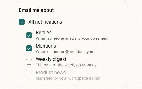
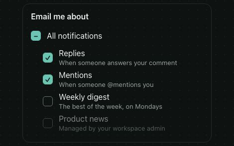
checked="mixed" draws a dash. Pressing a mixed box checks it.
<VStack gap="xs">
  <Checkbox label="All toppings" checked={all} onCheckedChange={(on) => setChosen(on ? toppings : [])} />
  <VStack gap="xs" style={{ paddingLeft: 32 }}>
    {toppings.map((t) => (
      <Checkbox key={t} label={t} checked={chosen.includes(t)} onCheckedChange={(on) => toggle(t, on)} />
    ))}
  </VStack>
</VStack>
States
Unchecked, checked, mixed and disabled, each with or without a description.
<VStack gap="xs">
  <Checkbox label="Unchecked" />
  <Checkbox label="Checked" defaultChecked />
  <Checkbox label="Mixed" checked="mixed" />
  <Checkbox label="Disabled" disabled />
  <Checkbox label="Disabled and checked" description="Included in your plan" defaultChecked disabled />
</VStack>
A to-do list
A label can be any node, so it can strike through a finished task.
      <Checkbox
        key={task.id}
        checked={checked}
        onCheckedChange={(on) => toggle(task.id, on)}
        accessibilityLabel={task.title}
        label={
          <HStack gap="sm" align="center">
            <Text color={checked ? 'textSecondary' : 'text'} style={{ textDecorationLine: checked ? 'line-through' : 'none' }}>
              {task.title}
            </Text>
            <Badge variant={task.due === 'Today' ? 'warning' : 'secondary'}>{task.due}</Badge>
          </HStack>
        }
      />
    );
  })}
</VStack>
Box at the end
controlPosition="end" puts the box after the label, as filters and settings lists do.
<VStack gap="xs" style={{ maxWidth: 360 }}>
  {FILTERS.map(({ label, count }, i) => (
    <VStack key={label} gap="xs">
      {i ? <Separator /> : null}
      <Checkbox controlPosition="end" label={label} description={`${count} items`} />
    </VStack>
  ))}
</VStack>
In real apps
Patine Pro screens built with it. Each opens on that screen, live, in the screens gallery.
Designs
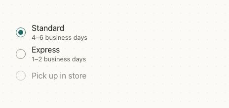
Patine and the web draw a rounded square, Material an 18dp square with a 2dp border, and iOS a circle, as in Reminders.
Guidelines
Write the label as a statement. Checked means yes; people read it once.
Don't phrase it as a negative. “Don't send me emails”, checked, is a double negative.
Use it for choices that apply on Save. A form gathers checkboxes and saves them together.
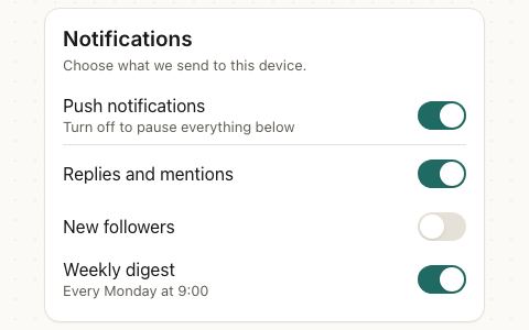
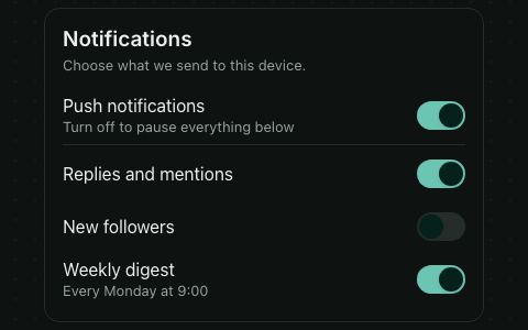
Don't use it for a setting that applies at once. That's a switch: it acts the moment it's flipped.
Accessibility
| Behaviour | |
|---|---|
| Role | checkbox, named by its label and described by its description. |
| Announced | checked, mixed and disabled. |
| Keyboard (web) | Space toggles it; a focus ring shows on keyboard focus. |
| Touch target | The whole row is the touch target, at least 44pt tall. |
| Reduce motion | The check draws without animating. |
- A checkbox without a text
label(a custom node, or none) needs anaccessibilityLabel. - For a required checkbox, set
aria-invalidand show the reason in text near it, as the first example does.
API
Checkbox
Checkbox also takes React Native's Pressable props, such as disabled (dims it and blocks toggling) and accessibilityLabel (its name for screen readers when the label isn't text).
| Prop | Type | Default | Description |
|---|---|---|---|
checked | boolean | 'mixed' | — | Controlled state. |
defaultChecked | boolean | false | Initial state when uncontrolled. |
onCheckedChange | (checked: boolean) => void | — | Called when the user toggles it. |
label | ReactNode | — | Text next to the box. Pressing it toggles too. |
description | ReactNode | — | Secondary text under the label. |
controlPosition | 'start' | 'end' | 'start' | Which side of the label the box sits on: 'end' as settings lists do. |
style | StyleProp<ViewStyle> | — | The row. |
styles | { label?: StyleProp<TextStyle>; box?: StyleProp<ViewStyle> } | — | Style slots: the label and the box. |
theme | DeepPartial<Theme> | — | Theme override. |
design | 'brand' | 'ios' | 'material' | 'web' | 'native' | from PatineProvider | The look to follow: brand, iOS, Material or web, or 'native' for the platform's own. |
Right to left and custom styles work the same on every component: see Internationalization and right to left and Styling.
For AI
Give this page to an assistant as Markdown, with Copy page at the top, or the whole API in llms-full.txt.
With the Patine MCP server, it asks for get_component_docs({ name: "Checkbox" })