MessageBubble & ChatComposer
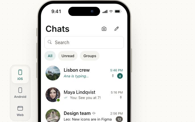
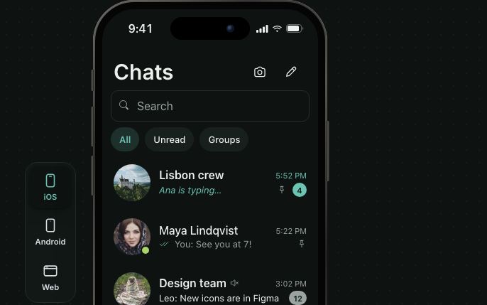
The parts of a chat: MessageBubble for each message, ChatComposer, the box under the thread that starts at one line, grows with the text and sends on the button or Enter (Shift+Enter for a new line), TypingIndicator while a reply is being written, and SuggestionChips for quick replies. Bubbles are round on iOS, have a small corner on the sender's side in Material and brand, and are outlined on the web.
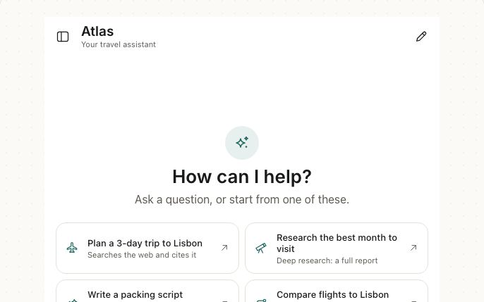
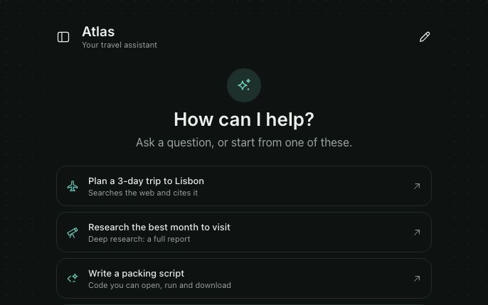
For an AI assistant with streaming Markdown replies, reasoning, tool calls, stop, retry and history, see Pro AI Chat.
<VStack gap="sm" style={{ width: '100%', maxWidth: 360 }}>
  {messages.map((m) => (
    <MessageBubble key={m.id} from={m.from}>
      {m.text}
    </MessageBubble>
  ))}
  <ChatComposer onSend={(text) => setMessages((all) => [...all, { id: Date.now(), from: 'me', text }])} />
</VStack>
Try the props
from<MessageBubble meta="9:41">See you at 7 by the river?</MessageBubble>
Anatomy
A chat screen is four parts you lay out yourself, usually in a FlatList above a composer:
<VStack>
  <MessageBubble from="them" />   {/* their message, at the start */}
  <MessageBubble from="me" />     {/* yours, at the end */}
  <TypingIndicator />             {/* while they write */}
  <SuggestionChips />             {/* quick replies */}
  <ChatComposer />                {/* the input and Send */}
</VStack>
Examples
Each example is live: edit the code and it runs.
A support chat
A store's help chat: the agent's messages carry a name and a time, quick replies answer the last question, and the agent types back after each message.
<VStack gap="sm" style={{ width: '100%', maxWidth: 380 }}>
  {messages.map((m) => (
    <MessageBubble key={m.id} from={m.from as 'me' | 'them'} name={m.from === 'them' ? AGENT : undefined} meta={m.meta}>
      {m.text}
    </MessageBubble>
  ))}
  {typing ? <TypingIndicator name="Jonah" /> : null}
  {last.from === 'them' && !typing ? (
    <SuggestionChips suggestions={['Yes, please', 'Send it by text', 'I’ll keep them']} onPress={send} />
  ) : null}
  <ChatComposer placeholder="Message Jonah" onSend={send} sending={typing} />
</VStack>
Typing indicator
TypingIndicator shows three dots in an incoming bubble while someone, or an assistant, writes a reply. Screen readers hear "Maya is typing" when it appears (or "Typing" without a name); the dots hold still when the OS asks to reduce motion.
<VStack gap="sm" style={{ width: '100%', maxWidth: 360 }}>
  <MessageBubble from="me">Is the 7pm table still free?</MessageBubble>
  <TypingIndicator name="Maya" />
</VStack>
namedesign<TypingIndicator />
Suggestions
SuggestionChips is a row of quick replies that scrolls sideways: prompts to start a chat from, or answers to the last question. onPress gets the chip's text, e.g. to send it.
<VStack gap="sm" style={{ width: '100%', maxWidth: 360 }}>
  {messages.map((m) => (
    <MessageBubble key={m.id} from={m.from}>
      {m.text}
    </MessageBubble>
  ))}
  {messages.length === 1 ? <SuggestionChips suggestions={REPLIES} onPress={send} /> : null}
  <ChatComposer onSend={send} />
</VStack>
design<SuggestionChips suggestions={replies} onPress={send} />
In real apps
Patine Pro screens built with it. Each opens on that screen, live, in the screens gallery.
Designs
Bubbles follow each platform: iOS's blue tails, Material's rounded tonal bubbles, and the web's flat ones.
Guidelines
Offer a few short suggestions. Two to four replies people would actually send.
Don't write paragraphs as chips. Long chips wrap and are slower to read than to type.
Name who's speaking in a group. name above a bubble tells people apart.
Don't disable Send without a reason. It's off only while the message is empty, which people can see.
Accessibility
| Behaviour | |
|---|---|
| Role | Bubbles are text (selectable); the composer's input is named "Message" and its button "Send" (both through labels); suggestions are buttons. |
| Announced | Send is disabled until there's text and busy while sending; with onStop it becomes Stop. |
| Keyboard (web) | Enter sends and Shift+Enter adds a line on the web; suggestions take Tab focus. |
| Touch target | Send, Stop and every suggestion have a 44pt touch area. |
| Reduce motion | The typing dots hold still with reduce motion on. |
API
MessageBubble
MessageBubble also takes View props.
| Prop | Type | Default | Description |
|---|---|---|---|
children | ReactNode | — | The message: a string, or any content. |
from | 'me' | 'them' | 'them' | 'me' sits at the end in the primary color. |
name | string | — | The sender's name above the bubble. |
meta | string | — | Under the bubble, e.g. the time. |
styles | { bubble?: StyleProp<ViewStyle>; text?: StyleProp<TextStyle> } | — | Style slots: bubble and the message text. |
theme / design | The theme override and the look to follow, as on every component. |
ChatComposer
| Prop | Type | Default | Description |
|---|---|---|---|
onSend | (text: string) => void | Required | Required. Gets the trimmed text; the composer then clears. |
value / defaultValue / onValueChange | string | — | Controlled or uncontrolled text. |
placeholder | string | 'Message' | |
disabled | boolean | false | Blocks typing and sending. |
sending | boolean | false | A spinner on the send button; blocks sending. |
onStop | () => void | — | While sending, the send button becomes Stop and Escape calls it, e.g. to stop an assistant's reply. |
leading | ReactNode | — | Before the input, e.g. an attach button. |
maxRows | number | 5 | Lines before the input scrolls. |
labels | { input, send, stop } | 'Message', 'Send', 'Stop' | For translation. |
style | StyleProp<ViewStyle> | — | The composer's box. |
theme / design | The theme override and the look to follow, as on every component. |
TypingIndicator
TypingIndicator also takes View props.
| Prop | Type | Default | Description |
|---|---|---|---|
name | string | — | Who is typing, for screen readers: "Maya is typing". Without it: "Typing". |
accessibilityLabel | string | — | Replaces what screen readers say. |
style | StyleProp<ViewStyle> | — | The bubble. |
theme / design | The theme override and the look to follow, as on every component. |
SuggestionChips
| Prop | Type | Default | Description |
|---|---|---|---|
suggestions | readonly string[] | Required | Required. The replies or prompts, in order; each is its label and the value onPress gets. |
onPress | (suggestion: string) => void | Required | Required. Called with the suggestion the user picks. |
disabled | boolean | false | Blocks every chip, e.g. while an assistant replies. |
accessibilityLabel | string | 'Suggestions' | Names the group for screen readers. |
style | StyleProp<ViewStyle> | — | The row. |
theme / design | The theme override and the look to follow, as on every component. |
Right to left and custom styles work the same on every component: see Internationalization and right to left and Styling.
For AI
Give this page to an assistant as Markdown, with Copy page at the top, or the whole API in llms-full.txt.
With the Patine MCP server, it asks for get_component_docs({ name: "ChatComposer" })