List
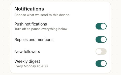
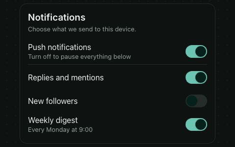
Rows grouped into a section, as in a settings screen. Each row has a title and optional description, something before it (an icon or avatar), and a value, control or chevron after it. iOS draws an inset grouped table with separators that start at the text; Material draws full-width rows without dividers; the web draws an outlined box.
<VStack gap="xl">
  <List>
    <ListItem title="Ava Martin" description="[email protected]" leading={<Avatar name="Ava Martin" />} onPress={() => {}} />
  </List>
  <List title="General" footer="We only send what you turn on.">
    <ListItem title="Notifications" trailing={<Switch accessibilityLabel="Notifications" defaultChecked />} />
    <ListItem title="Language" value="English" onPress={() => {}} />
    <ListItem title="Sign out" destructive showChevron={false} onPress={() => {}} />
  </List>
</VStack>
Try the props
titlefooterdesign<List
title="General"
footer="Changes apply on every device."
>
…
</List>
Examples
Each example is live: edit the code and it runs.
A settings screen
Several Lists, each a section with its own title and footer, make a settings screen. Rows carry an icon in leading, and a value, a Badge or a Switch at the end.
<VStack gap="xl" style={{ maxWidth: 420, width: '100%' }}>
  <List>
    <ListItem
      title="Maya Cohen"
      description="Apple Account, iCloud and more"
      leading={<Avatar name="Maya Cohen" src="https://picsum.photos/id/64/160/160" />}
      onPress={() => {}}
    />
  </List>
  <List title="Connectivity">
    <ListItem title="Airplane mode" leading={<Tile name="plane" color="#F97316" />} trailing={<Switch accessibilityLabel="Airplane mode" checked={airplane} onCheckedChange={setAirplane} />} />
    <ListItem title="Wi-Fi" leading={<Tile name="wifi" color="#3B82F6" />} value={airplane ? 'Off' : 'Home 5G'} onPress={() => {}} disabled={airplane} />
    <ListItem title="Bluetooth" leading={<Tile name="bluetooth" color="#3B82F6" />} value="On" onPress={() => {}} />
  </List>
  <List title="General" footer="Updates install overnight while your phone is charging.">
    <ListItem title="Software update" leading={<Tile name="settings" color="#8E8E93" />} trailing={<Badge variant="destructive">1</Badge>} onPress={() => {}} />
    <ListItem title="Storage" description="48.2 GB of 128 GB used" leading={<Tile name="database" color="#8E8E93" />} onPress={() => {}} />
  </List>
</VStack>
Open a conversation
Give a row onPress and it becomes a button. In the brand and iOS designs it also gets a chevron; set showChevron to force it on or off.
<List title="Messages" style={{ maxWidth: 420, width: '100%' }}>
  {THREADS.map((t) => (
    <ListItem
      key={t.name}
      title={t.name}
      description={t.last}
      leading={<Avatar name={t.name} />}
      trailing={<Text size="sm" color="textSecondary">{t.time}</Text>}
      showChevron={false}
      onPress={() => {}}
    />
  ))}
</List>
Picking one row
For a short list of choices, mark the chosen row with a check in trailing, as iOS Settings does. For a longer list, use SelectList.
<List title="App language" footer="The app restarts to apply it." style={{ maxWidth: 420, width: '100%' }}>
  {LANGUAGES.map((name) => (
    <ListItem
      key={name}
      title={name}
      showChevron={false}
      onPress={() => setLanguage(name)}
      accessibilityState={{ selected: name === language }}
      trailing={name === language ? <Icon name="check" color="primary" strokeWidth={2} /> : null}
    />
  ))}
</List>
Account settings with Sign out and Delete
disabled dims a row and blocks presses. destructive draws the title in the danger color, for rows such as "Delete account"; put them in their own section at the end.
<VStack gap="xl" style={{ maxWidth: 420, width: '100%' }}>
  <List title="Account">
    <ListItem title="Email" value="[email protected]" onPress={() => {}} />
    <ListItem title="Two-factor authentication" value="Requires a verified phone" disabled onPress={() => {}} />
  </List>
  <List>
    <ListItem title="Sign out" showChevron={false} onPress={() => {}} />
    <ListItem title="Delete account" destructive showChevron={false} onPress={() => {}} />
  </List>
</VStack>
In real apps
Patine Pro screens built with it. Each opens on that screen, live, in the screens gallery.
Designs
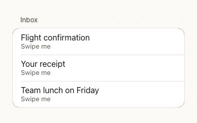
iOS draws an inset grouped table with a section title above; Material uses full-width rows with a title in the primary color; Patine and the web use a bordered card.
Display
Display
Display
Display
Guidelines
Show the current value. People see the setting without opening it.
Don't make people open a row to see it. A bare chevron hides what's set.
Name the control after its row. A switch in trailing gets its own label, usually the row's title.
Don't make the row and its switch do different things. Pressing anywhere on the row should do what the switch does.
Accessibility
| Behaviour | |
|---|---|
| Role | A row with onPress is a button named by its title, description and value together. The section title is a heading. |
| Announced | disabled; set accessibilityState={{ selected }} on a row that marks a choice, as in Picking one row. |
| Keyboard (web) | Pressable rows take Tab focus and press with Enter or Space. |
| Touch target | Every row is at least 44pt tall. |
| Reduce motion | Rows don't animate. |
- Put a control in
trailingwith its ownaccessibilityLabel(usually the row's title), since the row itself isn't the control.
API
List
List also takes View props.
| Prop | Type | Default | Description |
|---|---|---|---|
title | string | — | A section heading above the rows. |
footer | string | — | A note under the rows. |
children | ReactNode | — | ListItem rows. |
styles | { content?: StyleProp<ViewStyle> } | — | Style slots: content is the box around the rows. |
theme | DeepPartial<Theme> | — | Theme override, passed to the rows. |
design | Design | from PatineProvider | The look to follow, passed to the rows. |
ListItem
| Prop | Type | Default | Description |
|---|---|---|---|
title | string | Required | Required. |
description | string | — | A second line. |
leading | ReactNode | — | An icon or avatar before the text. |
trailing | ReactNode | — | A control after the text, such as a Switch or Badge. |
value | string | — | The current value, in secondary text at the end. |
showChevron | boolean | with onPress, in brand and iOS | A chevron at the end. |
destructive | boolean | false | The title in the danger color. |
disabled | boolean | false | Dims the row and blocks presses. |
onPress | (event) => void | — | Makes the row a button. |
href | string | — | Makes it a link: a real <a> on the web, Linking.openURL on iOS and Android after onPress (call event.preventDefault() to stop it). |
external | boolean | false | Opens href in a new tab on the web. |
styles | { title?: StyleProp<TextStyle> } | — | Style slots: title is the title's text. |
theme | DeepPartial<Theme> | from List | Theme override. |
design | Design | from List | The look to follow. |
Right to left and custom styles work the same on every component: see Internationalization and right to left and Styling.
For AI
Give this page to an assistant as Markdown, with Copy page at the top, or the whole API in llms-full.txt.
With the Patine MCP server, it asks for get_component_docs({ name: "List" })