Avatar
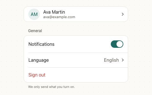
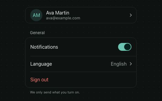
A picture of a person or a thing. When there's no picture, or it fails to load, it shows the initials of name instead.
<VStack gap="md">
  {PEOPLE.map((person) => (
    <HStack key={person.name} gap="md" align="center">
      <Avatar name={person.name} src={person.src} />
      <VStack>
        <Text weight="medium">{person.name}</Text>
        <Text size="sm" color="textSecondary">{person.role}</Text>
      </VStack>
    </HStack>
  ))}
</VStack>
Try the props
namesrcsizeshapedesign<Avatar name="Maya Cohen" />
Examples
Each example is live: edit the code and it runs.
A team directory
A company directory: a photo when there is one, initials when not, a presence dot in the corner, and a search that filters by name or role.
<VStack gap="sm" style={{ width: '100%', maxWidth: 420 }}>
  <SearchField value={query} onChangeText={setQuery} placeholder="Search people" />
  <List>
    {shown.map((person) => (
      <ListItem
        key={person.name}
        title={person.name}
        description={person.role}
        accessibilityLabel={`${person.name}, ${person.role}, ${person.status}`}
        leading={
          <View>
            <Avatar name={person.name} src={'src' in person ? person.src : undefined} />
            <View style={{ position: 'absolute', right: -1, bottom: -1, width: 12, height: 12, borderRadius: 6, borderWidth: 2, borderColor: '#fff', backgroundColor: STATUS[person.status] }} />
          </View>
        }
        onPress={() => {}}
      />
    ))}
  </List>
  {shown.length ? null : <Text color="textSecondary">No one matches “{query}”.</Text>}
</VStack>
Sizes and shapes
size is sm (32), md (40), lg (56) or a number of points. shape="square" rounds the corners instead, for teams and companies.
<HStack gap="md" align="center">
  <Avatar name="Ana Silva" size="sm" />
  <Avatar name="Ana Silva" />
  <Avatar name="Ana Silva" size="lg" />
  <Avatar name="Acme Inc" size={72} shape="square" />
</HStack>
Fallback
With no src, or one that fails to load, the avatar shows the first letters of the first and last words of name. With no name either, it shows a blank circle.
<HStack gap="md" align="center">
  <Avatar name="Maya Cohen" src="https://picsum.photos/id/64/160/160" />
  <Avatar name="Maya Cohen" />
  <Avatar name="Broken Link" src="https://invalid.example/404.png" />
  <Avatar name="Prince" />
  <Avatar />
</HStack>
Who's online
Wrap it in a View to pin a status dot or a count to its corner.
<HStack gap="lg" align="center">
  <View accessibilityLabel="Maya Cohen, online">
    <Avatar size="lg" name="Maya Cohen" src="https://picsum.photos/id/64/160/160" />
    <Dot color="#22C55E" />
  </View>
  <View accessibilityLabel="Leo Martin, away">
    <Avatar size="lg" name="Leo Martin" src="https://picsum.photos/id/1005/160/160" />
    <Dot color="#F59E0B" />
  </View>
  <View accessibilityLabel="Ana Silva, offline">
    <Avatar size="lg" name="Ana Silva" />
    <Dot color="#9CA3AF" />
  </View>
</HStack>
Who's editing
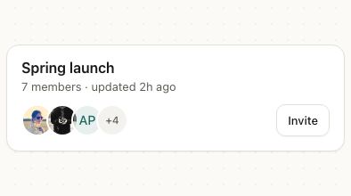
Overlap avatars with a negative margin and a ring in the background color, and end with a count of the rest.
<HStack align="center" gap="md">
  <HStack accessibilityLabel={`${MEMBERS.length} members`} accessible>
    {MEMBERS.slice(0, SHOWN).map((name, i) => (
      <View key={name} style={[ring, { marginLeft: i ? -12 : 0 }]}>
        <Avatar name={name} />
      </View>
    ))}
    <View style={[ring, { marginLeft: -12, width: 44, height: 44, alignItems: 'center', justifyContent: 'center', backgroundColor: colors.surface }]}>
      <Text size="sm" weight="medium">+{MEMBERS.length - SHOWN}</Text>
    </View>
  </HStack>
  <Text color="textSecondary">Maya, Leo and 5 others are editing</Text>
</HStack>
Workspaces in a switcher
shape="square" rounds the corners instead of a circle, the usual sign of an organization rather than a person.
<VStack gap="md">
  {WORKSPACES.map((w) => (
    <HStack key={w.name} gap="md" align="center">
      <Avatar name={w.name} shape="square" />
      <Text weight="medium" style={{ flex: 1 }}>{w.name}</Text>
      <Badge variant={w.plan === 'Pro' ? 'default' : 'secondary'}>{w.plan}</Badge>
    </HStack>
  ))}
</VStack>
In real apps
Patine Pro screens built with it. Each opens on that screen, live, in the screens gallery.
Guidelines
Always pass name. It's the fallback initials and what a screen reader says.
Don't leave a broken picture blank. Without name, a failed image is an empty circle.
Round people, square organizations. The shape tells a person from a team at a glance.
Don't rely on the dot's color for status. Write the status in the label or next to the name too.
Accessibility
| Behaviour | |
|---|---|
| Role | An image named by name, so a screen reader reads the name once, not the initials. |
| Announced | None. |
| Keyboard (web) | Not focusable on its own; wrap it in a pressable to make it a button. |
| Touch target | Only matters when it's pressable: md (40) and up, or give the pressable hitSlop. |
| Reduce motion | Nothing moves. |
- Leave
nameout for a purely decorative picture next to a name that's already written.
API
Avatar
| Prop | Type | Default | Description |
|---|---|---|---|
src | string | ImageSourcePropType | — | The picture. Falls back to initials when missing or broken. |
name | string | — | Read by screen readers, and the initials when there's no picture. |
size | 'sm' | 'md' | 'lg' | number | 'md' | 32, 40 or 56 points, or any number. |
shape | 'circle' | 'square' | 'circle' | Round, or rounded corners. |
style | StyleProp<ViewStyle> | — | The avatar's box. |
theme | DeepPartial<Theme> | — | Theme override. |
design | 'brand' | 'ios' | 'material' | 'web' | 'native' | from PatineProvider | The look to follow: brand, iOS, Material or web, or 'native' for the platform's own. |
Right to left and custom styles work the same on every component: see Internationalization and right to left and Styling.
For AI
Give this page to an assistant as Markdown, with Copy page at the top, or the whole API in llms-full.txt.
With the Patine MCP server, it asks for get_component_docs({ name: "Avatar" })